Acrylic paint over two glued together calendar photographs. The photo on the left included flowers, which probably suggested the Garden of Eden idea... hence 'Eve in the Garden.' That would make the striped dangly bit the snake, of course. I'm not sure where the numbers and arrows came from, though. It's a mystery!
Arna goofed around in photoshop to get this blue version:
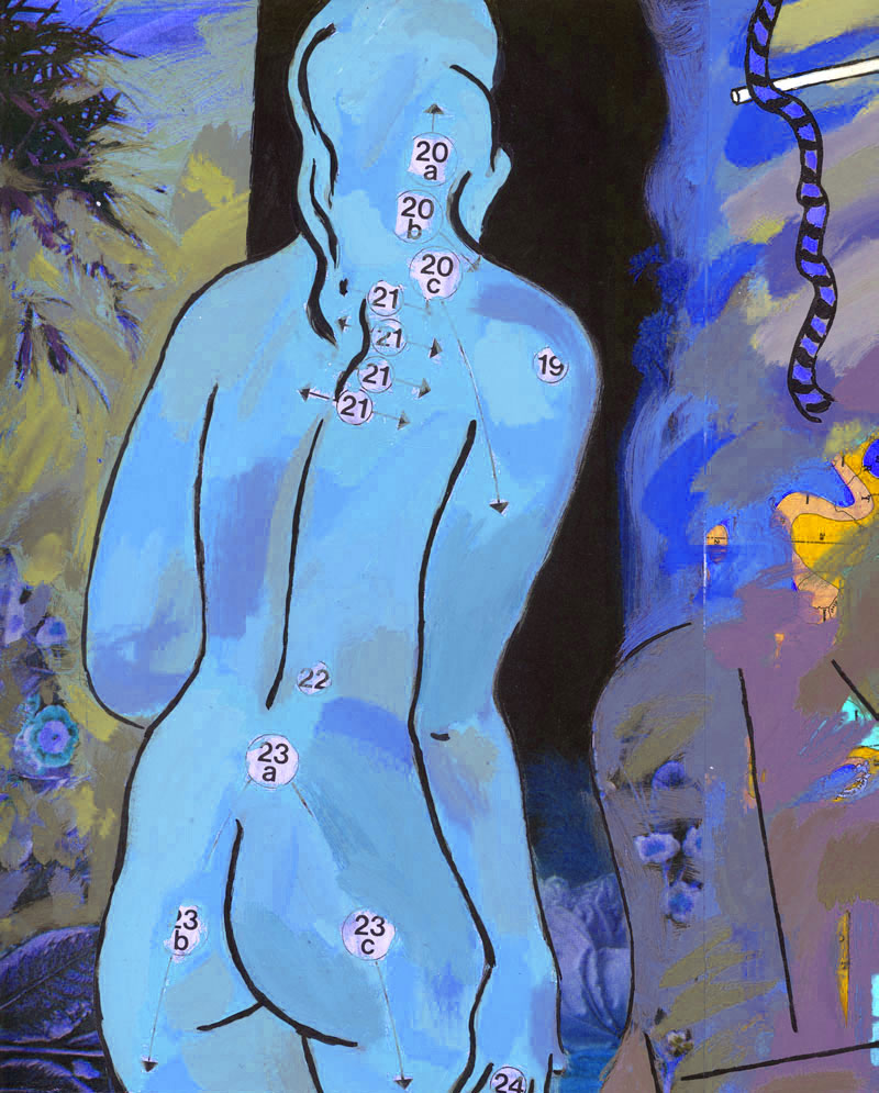
This one below is the original:

10 comments:
this is a very interesting piece what inspired it
I'm leaning towards the blue version. A snake? I thought it Hobbes' tail? ;)
I prefer the pink.
I imagine the numbers represent the places she'd like a kiss.
As I mentioned in the post, the inspiration for this painting probably came from the flowers featured in the calendar photo I used as an underpainting. I think the nude came from a figure drawing I did in class (at OCA in Toronto). So... Plants + female nude = Eve in Eden!
Steve: "Sometimes a snake is just a snake." I think Freud said that...
Elliot: Or maybe acupuncture points? Or a 'game plan,' like in football? I'm really wracking my brain about where those numbers came from. They were definitely a printed part of the image below the paint I added, just not sure how they relate to the flowers!
Thanks for the interest all!
I like this one a lot.
I like the numbers and arrows!. They make it very modern.
I don't know if I prefer the original or the blue one.
What I like about the original is that you can see more the greens and blues over the body than in the blue one.
Once you throw Freud into the mix there's really nothing one can say.
I guess I'll go toss some pencils into a bucket...
Pencils into a bucket? What would Freud say about THAT!?
Exactly...
Oh that Sigmund was such a card!
Thanks for the comment, Alberto! You make very good points about the colour of the original painting. The cool colours on the body in that one make the figure a little less flat and the 'surface' more lively. Cheers!
THese are beautiful!!
Post a Comment